Zoomerang.com
Zoomerang, (acquired by SurveyMonkey), was a provider of web-based survey solutions .
As a Web Producer, my roles and responsibilities in this project include:
- Managed and implemented visual designs with metric-informed approach to boost conversions.
- Turned wireframes and mock ups from product manager’s requirements into webpages.
Goal:
- Identify the homepage design and flow that would optimize the registration process.
Key Prior Pages to Registration Page
Often users are taking the long route to signing up - Homepage > Sign up > Pricing > Registration > Creating a new Survey.
Homepage Testing
Homepage version “C” won!
Since version “C” won, we decided to launch the version “C” as the new homepage officially. We believed that reducing cognitive load by having more graphics and less texts helped in converting the “C” version well.
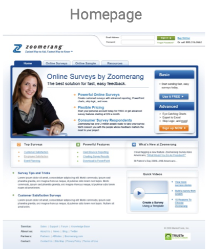
Old Homepage
The old homepage design was shorter. Hard to digest - a lot of texts to read based on usability testing results.
New Homepage
The New Zoomerang homepage contains more information such as the overview of the pricing, testimonials, quick video and other information that visitors would need to sign up.
New Registration Flow
With the redesigned flow, we had streamlined the sign up process from the homepage in 2 steps - Homepage > Registration > Create a Survey
By using the widget, it allows users to easily create a survey. The new flow skips 2 screens since the new Homepage contains most of the details that visitors would need.


