EMC Elevate Mobile App
Sales Mobile App
– A tool to arm Field Sales to increase productivity while on-the-go
CHALLENGES
–Salesforce is an overkill application to use for creating opportunities – too many fields that I don’t need
Fields Sales Reps
–Being away from desk, it won’t be practical to open up laptops when looking for Account information, creating opportunities or track
–Stay updated with company news as wells as customer’s organization before meeting with customers
Area / District Managers
–Difficult to see their Field Sales Reps’ sales or if they are hitting their targets
A Storyboard identifies key moments in the experience of Field Sales management needing information from Sales Reps anytime.
Based on the storyboard, 2 personas were identified
Field Sales Rep
Field Sales Management
User Stories
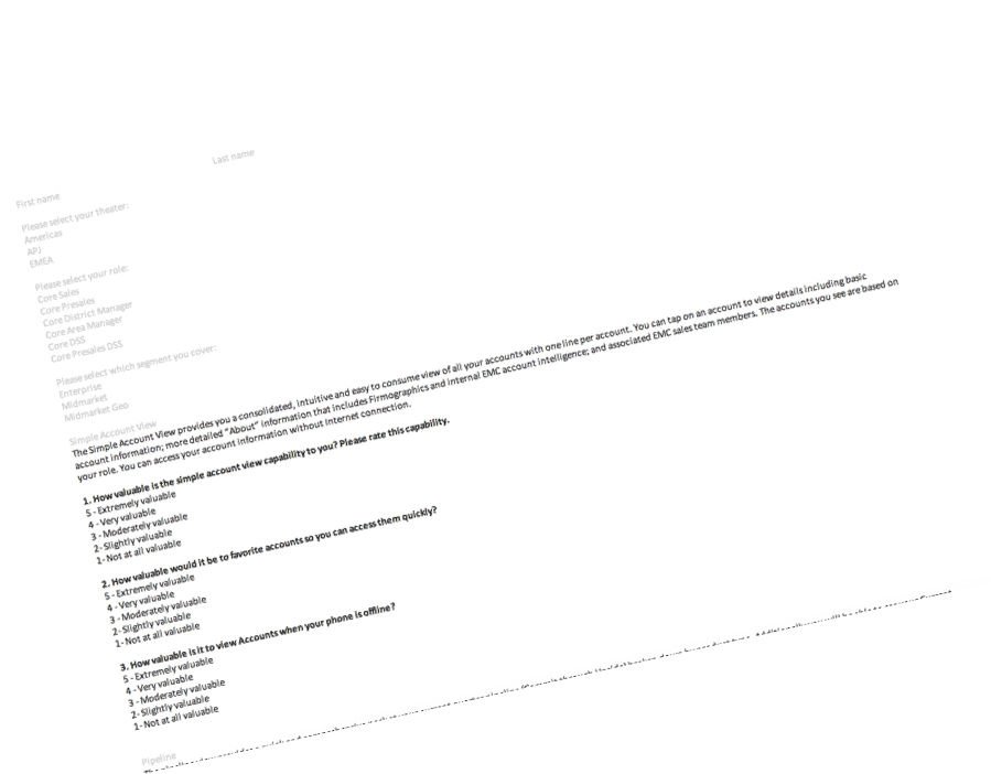
Validate Features with users through SURVEY
To ensure that there’s no gap between the management and reps, an online survey was sent out to confirm features with Field Sales and Management.
Initial Sketches
Whiteboarding
I prefer to start out with whiteboarding with the Dev team present in the room to brainstorm with the possibilities that we can create in the app in order to achieve the best possible interaction in the flow.
App Map
Wireframes
Complete screen-by-screen flow
Visual Design
Usability Testing
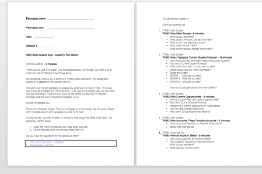
This test is to validate the features, and test the usability of the EMC Sales Mobile App. The test is intended to answer these questions:
Does the app have the features needed to support EMC sales people while mobile?
Do the features work well; is the user interface easily understood and easy to use?
Method
Moderated, scripted walkthrough
Conducted on an in-development prototype, with a visually design appearance. It will not be 100% functional.
The moderator will walk the participant through 7-8 main tasks, recording actions and comments.
Areas of Testing: Main Screen, Accounts, Pipeline, Menu, Create Opportunity, News Flash Notification.
45-minute test sessions over 2 days, 9 am to 5 pm. Participants will be video recorded as they interact with the prototype app on a typical mobile device.
15 Total Participants
1 Area Manager
2 District Manager
8 Sales Representative
1 Systems Engineer Manager
3 Systems Engineer
TEST RESULTS
12 out of 15
Favoriting - No swiping. Just toggle on and off with a tap, whether on Main Screen, in a list, or on Account Detail.*
9 out of 15
View all opportunities associated with an account
Current account news from EMC and from the web.
15 out of 15
•Opportunity Creation - “Opportunity edit”
•Add calendar to easily select dates
SPECS
Delivered to Development Team
Specs are made for iOS and Android
CONCLUSION
Over 800 downloads
from the Dell’s internal app store
What’s Next?
Usability testing using production version
Change behavior from the usability results:
- Favoriting - No swiping. Just toggle on and off with a tap, whether on Main Screen, in a list, or on Account Detail.*
- View all opportunities associated with an account
Current account news from EMC and from the web.
“Really helpful to view all my account information on the go!
”


