Dell SPACES
Dell Spaces is a mobile app that guides visitors or new employees inside Dell campuses. It removes the pain of asking around for directions by using the map online with a smart and dynamic navigation mobile app.
ROLES AND RESPONSIBILITIES:
– Led user research and usability testing activities
– Worked on key user flows and wireframes
– Oversaw interaction, visual design screens and high-
fidelity prototypeFacilities and Location Prioritization
Problems
•Challenges in Identifying Unassigned Cubicles
•Assignment of Multiple Employees To Offices
•Unknown Open Collaboration Areas
•Multiple Buildings On Campus
Stakeholder Interview + Assessment
Outcome
- User Personas
- User Stories
- Use Cases, User Flows
Stakeholder Engagement Process
Team Planning
Team Discussion
Project Manager gathered the team to plan all the high-level activities.
Research
Visited Dell Santa Clara Campus
I’ve interviewed all the receptionists in Santa Clara Dell Campuses. They had around 40 visitors per day depending on any events happening within this location.
Building Up the Product Story
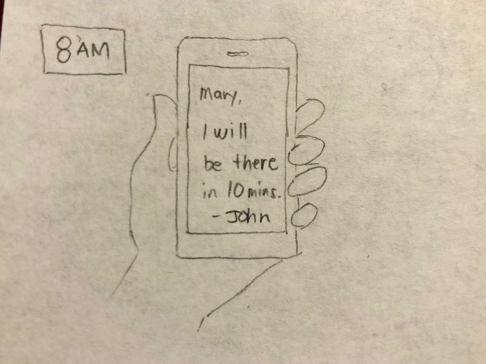
I’ve sketched out an idea of how a user may use a feature to visualize the potential experience. I used storyboarding to get a full picture of the people and their problem. It also serves as a key early collaboration tool in our team.
Understanding the Users
The storyboard naturally lead to establishing primary characters to represent who will use the product. This helps foster empathy for the user and helps the team stay people focused rather than feature focused.
Empathy Map
Helps the team understand the user’s mindset
User Journey Map
Capture the experience while interacting with the product
Collaborative Whiteboarding
It took hours of whiteboarding to harden the concept. Mapping out key user flows early ensures that what is eventually designed can actually be built while collaborating ideas with Development and Product teams.
Outlining the Key User Flows
Sketch was used to create screenflow using wireframes.
By working with wireframes which is great way to get your clients and your entire team to focus, it eliminates opportunities to get distracted from thinking about visual design.
UI Patterns
Visual Design
Usability Testing
Method
-Casual, random user interviews
-Conducted on builds for iOS and Android
-4 main tasks, recording actions and comments
-Areas of Testing: Main Screen, Navigating from desk to common areas, main menu.
-20-minute test sessions over 2 days. Participants were video recorded as they interact with the mobile device
-Total 5 Participants – 3 New Employees, 2 Visitors
Results
•5 out 5 did not know that SC1 is building 1 in Santa Clara •One had thought SC1 = Ground floor
•4 out 5 participants could not find the list of “Favorites” in the app.
•3 out 5 participants could not find other POIs not listed in the home screen like Training rooms, Labs, etc.
700+ Downloads from the Dell App Store
Next Steps
•Revisit the navigation
•Looking into implementing Augmented Reality
•Add Hotel Spaces/Conference Booking System
•Broadening scope to other locations – India, Ireland, MA
“I was in urgent need to find a room in Round Rock 2 for a meeting. Fired up Spaces. Saved me from being late to meeting. Worked like a charm!”


